ShopDreamUp AI ArtDreamUp
Deviation Actions


Suggested Deviants


Suggested Collections


You Might Like…


Comments35
Join the community to add your comment. Already a deviant? Log In
Ignore the stars; I don't use them. <img src="e.deviantart.net/emoticons/let…" width="15" height="15" alt="
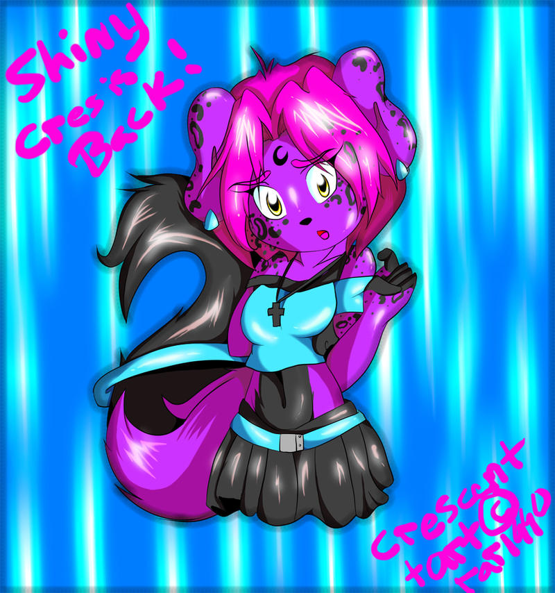
Awesome job on the fur and hair! You gave it volume and texture with your shading. Your linework is solid and works well, and your anatomy and proportions are great*! Nice job!
*Not counting the head because that's your style and it makes sense.
However, I will disagree with ~Darksider16's critique (and you can disagree with mine). You used way too much white and saturated colors. Pure white, pure black, and saturated colors are often used to draw the viewer's eye to a certain area. Your use of whites distracts the viewer because it's used in way too many areas, way too prominently. This is especially bad in the background, which isn't supposed to draw attention.
I understand that your goal was shininess, and there is a way to show that without using too much white. Draw like you're drawing metal-- use high contrast, but don't go to pure white too much. Use a lot of light tones instead of a lot of white. If you want to show something like shininess, it's best to be subtle. If you want to draw a field, you just draw in patches of grass, not every blade.
Regarding saturated colors-- don't use them in large areas! For large areas, use less saturated colors to fill them, then use saturated colors in details, or where you want to draw the eye towards!
Now for a few tips! Turn your image into greyscale, then squint! If you can see the different parts easily and decipher your drawing, even when it's blurred, then you're good to go! The reason I'm telling you this is that the hair and the purple fur are the same tone! If you use more values, the more depth something has!
You might not want to write in that color. Try typing it in another, less similar toned color so that you can read it easily. (This is what I meant with the hair and purple fur.)
Here's a tutorial I highly recommend: [link]